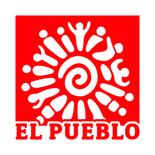

Raleigh, NC — Looking towards a new generation of changemakers, the organization’s logo has been refreshed. Much like the work of El Pueblo, this new logo builds on the history of the organization and its established reputation of 27 years.
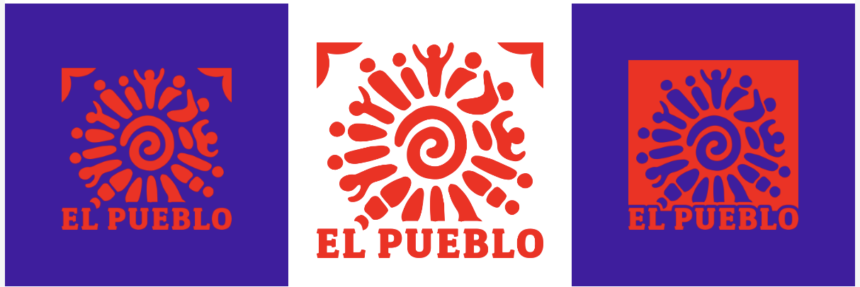
The redesign kindles memories of previous iterations of the organization’s logo by retaining the red sun that has become synonymous with El Pueblo.
“El Pueblo’s strength is only possible because of the community and the individuals who act to make change happen, we hope that our new logo reflects that.” — Iliana Santillan, Executive Director of El Pueblo.
The design was inspired by papel picado, a traditional Mexican decorative craft used in celebrations, to express the appreciation and celebration of the Latinx culture in the work of El Pueblo.
The colors that represent El Pueblo are Red, Yellow, and Purple. Red for the strength of El Pueblo and its community. Yellow for the sun-like vitality that El Pueblo seeks to achieve through its work. And Purple because of its richness, where El Pueblo is rich in community, culture, and history.
This new logo design was created by local artist Alexa Elena Chumpitaz.
This post is also available in:
 Español (Spanish)